The Peepul connect
An education focused international NGO, Ark, needed a contextually relevant brand for its Indian audience. From a lineage of transformation in the education sector, a well established value system and a global reach, the organization had all it takes to establish itself as a leading change agent in the Indian education landscape. The challenge was to create resonance with the semi urban Indian audience and with a diverse pool of people who are a part of this ecosystem – teachers, kids, parents as well as the Government. We created a design language that is relatable to all its audience and something that took us back to the roots of learning itself.
Creating a people centric brand language
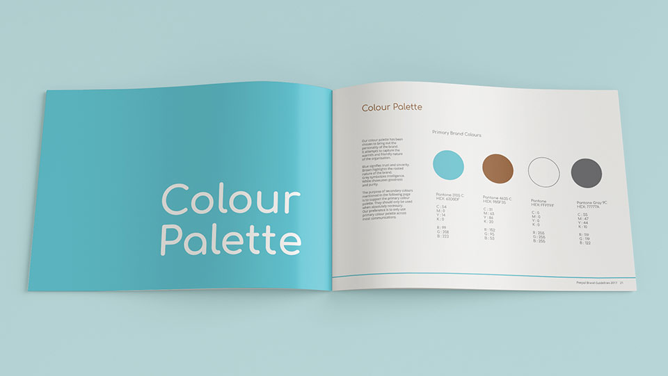
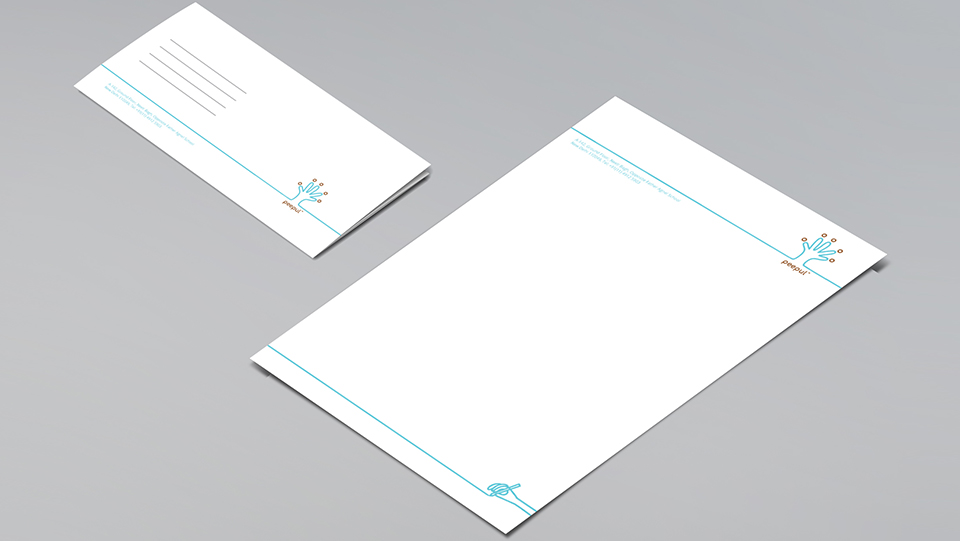
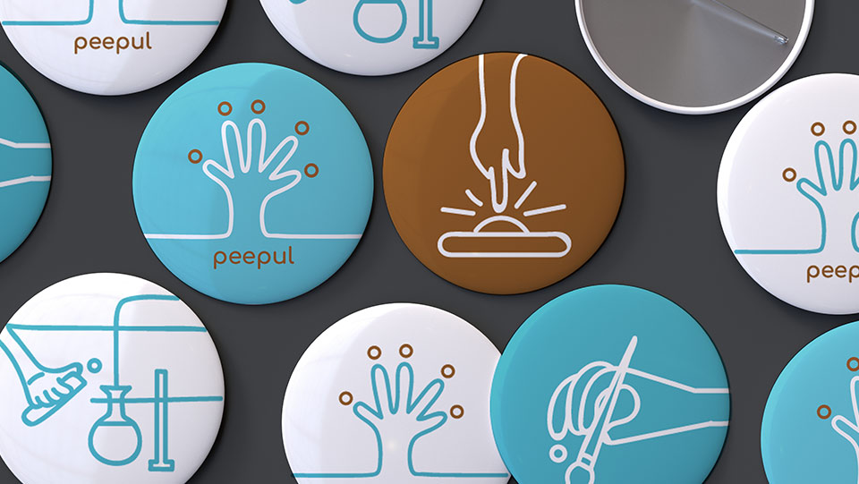
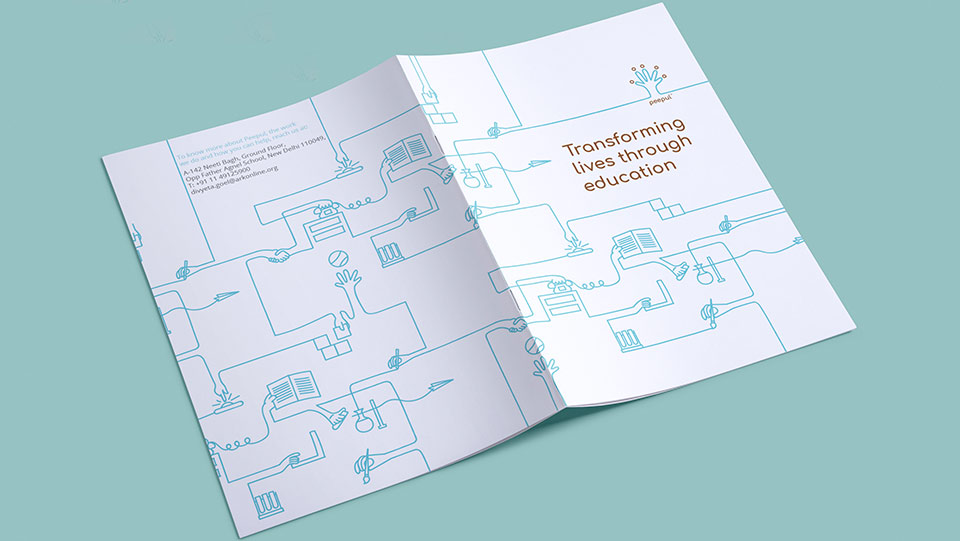
We came up with the name ‘Peepul’. It comes from the peepul tree that is considered as the symbol of enlightenment in India. The fact that the word also sounds like ‘people’ is no accident as it is meant to highlight the people centric nature of the organization. Our logo represents a child’s hand and also resembles the tree of enlightenment while the fingers look like people who have come together for a cause. The blue line is used as a continuous visual device that transforms into various other elements that relate to children and capture the school ecosystem. The concept is to empower everyone to carry forward this line and scribble their own version of the illustration while building stories around it.
Representing a purpose
Empowering yet simple, dynamic and imaginative, the brand was taken forward even within the various behavioral facets of the organization – in its attitude, tonality and working style. With a workshop that helped teachers and volunteers embrace the new language, we induced the Peepul culture within the very core of the NGO and paved the way for the next cycle of growth.