The future is Open
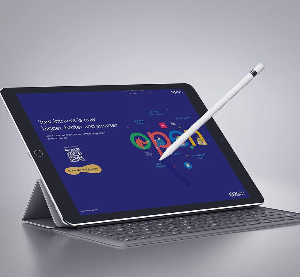
Bajaj Finserv, India’s leading NBFC, was in the process of re-launching its intranet with a bunch of new and improved features and functionalities. Open, the new Bajaj Finserv employee portal, was slated to be the one-stop-shop for everything an employee needs within an organisation. Functioning as an information portal to know about products, processes, initiatives. To an engagement medium for voicing opinions, availing offers and consuming and contributing content.
The Objective? Make Open the go-to portal for employees to engage in conversations and stay updated with information about the organisation and its people. Through the communication, the aim was to make logging on to Open a daily habit among the employees. The portal’s objective was to bring more people onto the platform and make them spend more time engaging and interacting with content as well as their colleagues.
Access Anything Anywhere
The goal was to deliver a solution that would create an aura of dynamism and intrigue for the launch; while using visual elements to keep users hooked so they keep coming back to see more. Our approach was to leverage mobility on an organisational scale; for a smarter, immersive and connected world on the move.
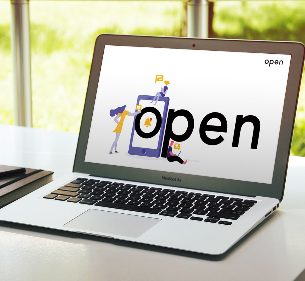
Open a world of new possibilities
With the brief came the subtext. We understood that a brand like this had to shoulder the responsibility of being the voice of a 20,000 strong organisation. All the while being interesting enough for users to engage with it in the long term. Our approach to the concept centers around the fact that Open is responsive, dynamic and interconnected. The identity has graphic interaction at its core, with varying visual elements mingling with each other and their environment to communicate the brand message in a subtle manner.
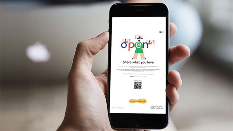
We focused on making Open a fluid, expansive and vivid experience for its audience. The logo sits at the heart of the identity and is anchored within the new system. In order to introduce multiple playful elements, the logo was made to be remarkably simple. The typeface chosen was Avenir for its versatility and representation of the future. While the tone of voice was welcoming with the promise of information, relevant content, recreation, fun and rewards.